
is a connected learning experience.
It is a product suite that connects teachers and students not only to an assessment, but also to a wide range of educational tools across print and digital; math and literacy; and professional development.
Our goal for the visual identity and brand development was more than a logo redesign, we initiated a complete brand transformation, with the intention to change the perception of i-Ready: from a single product to that of a robust integrated portfolio.

ROLE: Creative Direction, Strategy, Brand Development, Graphic Design
We needed to rethink how we expressed the brand as a whole.
We started at the portfolio-level.
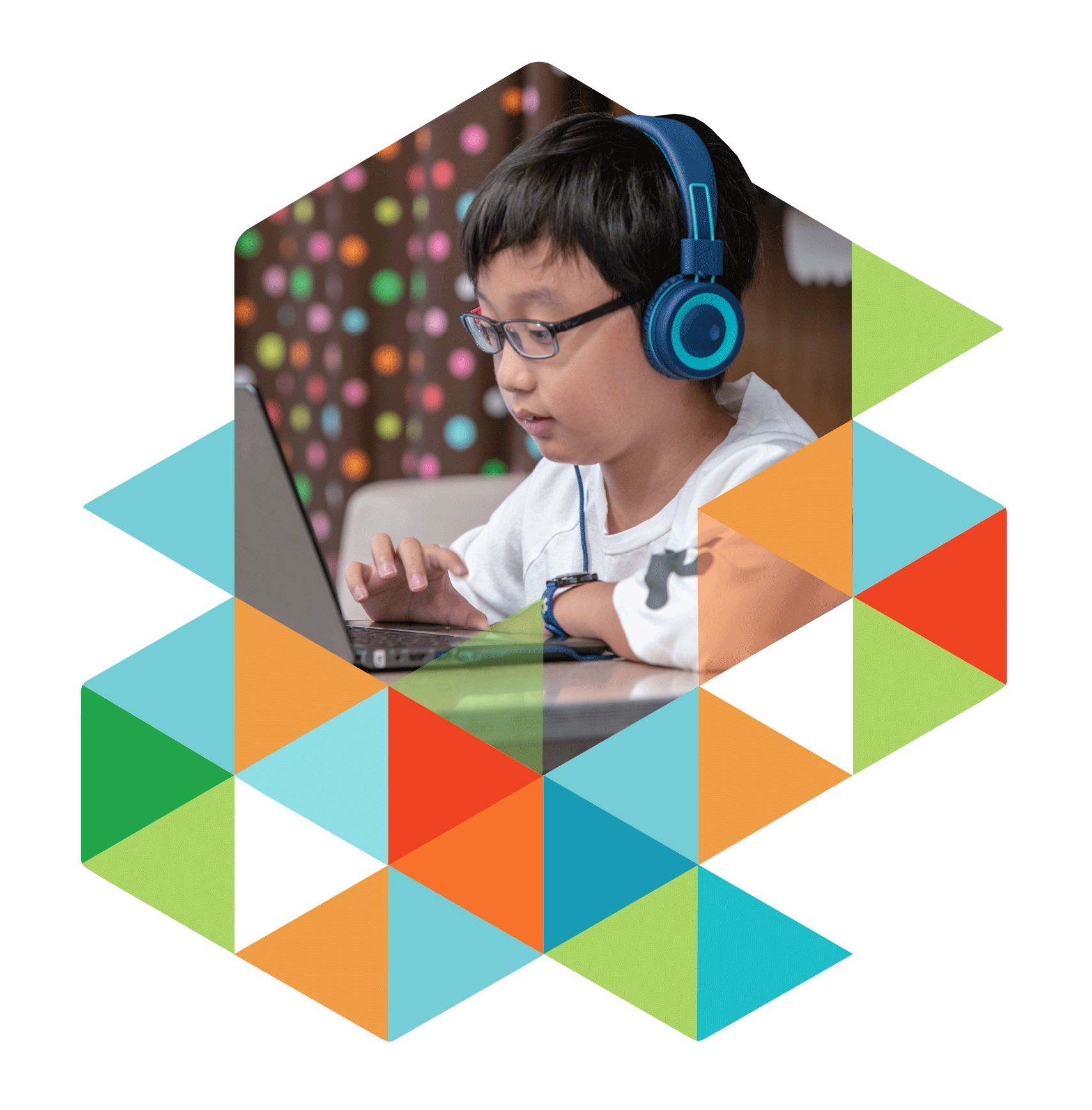
At the core of the brand's identity is the i-Ready cube—a recognizable element within the education space that holds a great deal of brand equity. Rather than reinventing it, we used the cube as our structural foundation, breaking it down into its component forms, to explore new possibilities that could expand the visual language.
This approach created a flexible framework—one that could scale across products, audiences, and contexts without losing the brand’s core identity.
We were able to isolate a singular shape—a simple triangle—and use it to create both a bold pattern and a subtle grey grid used for the alignment of elements.


The pattern was used to create breakaway ‘tessellations’—a nod to digital pixels and the connection of products to the digital assessment.


A System is Born
We evolved the aesthetic into a system, giving each sub-brand a curated color palette that preserved its unique personality while connecting it back to the full portfolio—creating a flexible and visually unified, brand ecosystem.
Continuity counts
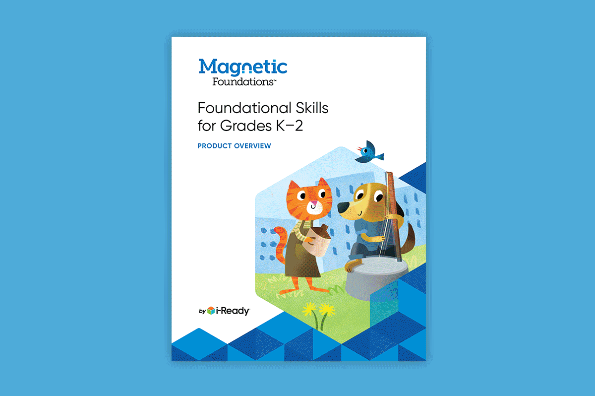
Icons were redesigned to be more modern and accessible and work with the new design system. Tables and charts were similarly simplified and streamlined.

Say, "i-Ready"
An investment in proprietary photography personalized the work and extended the brand theme to create a human connection directly with our audiences.

Bringing Assets to Life
We added motion where it counts—social, paid media, and advertising—where the need to stand out among competitors' static images mattered the most. Our playful, vibrant product illustrations were the perfect opportunity for motion, intended to breathe life into campaigns.


The newly created visual language was brought together across all deliverables, creating a cohesive identity while maintaining the individuality of each sub brand.


We saved the best for last, designing an entire collection of branded merchandise for giveaways at in-person events.